Dashboard/Home enables you to have an overview of the core elements of the skill’s functionality. The graphical user interface of the multi-tenant platform provides you access to all of your most important metrics, from knowing the increase in user traffic to the seasonal trends of your skill.
The Dashboard visuals provide you with insights into the most crucial key performance indicators relevant to the skill. The Total Users count on the extreme left of the horizontal bar right on top of the dashboard shows the total number of users who visited your skill. The cumulative information displayed on the horizontal bar represents the entire lifetime of your skill.

The second key performance indicator (KPI) from the left shows the number of Questions Asked. Every time a skill has interacted with a back and forth question and answer pertaining to your skill, it is captured as questions asked. In other words, the counter displays the number of insights to your skill.
The Events counter displays the total number of event entries published in the platform through the skill and the News Items counter shows the number of news items published and available on your skill.
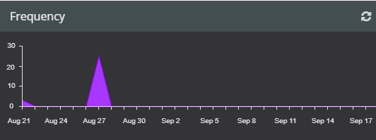
The Frequency of usage represented by an area chart is a measure of the questions asked broken down by day as seen below.
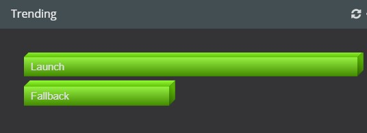
The graphic visual on the right of the dashboard displays data on what is Trending over a period of time. In other words what is popular at this time. It mainly concerns the usage of intents with regard to the skill. The more the number of questions asked the more the score shifts. Basically, the bar graph shown below projects a generalization of the results pertaining to the trending questions that are being asked concerning the skill, and the colour green signifies the patterns of popularity.
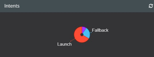
The pie chart on the dashboard shows the breakdown of Intents used for every skill. This outlines the lifetime view of the skill.
The Refresh Widget on the top right corner of each graph is meant to refresh data for the respective indicators.
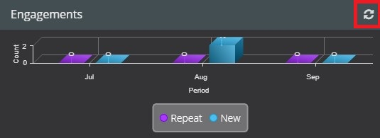
The Engagements visual representation shows both new and returning visitors.
The colour blue represents the new users who have not used your skill before while purple depicts those users who have used your skill in the previous month and are revisiting to use the skill again.
For clients that have managed skills, the dashboard is constantly monitored by the expert team at VOGO Voice; and feedback is provided to the customers based on the trend and usage of the skill that is generated on the dashboard.
- To learn more about News, click here.
- To learn more about Events, click here.